In our Designing Icons series, we’re talking about the basics of icon design. In our first article, we gave a brief history of icons__, and i____n the last round, we talked about the importance of understanding how context is king when choosing visual metaphors.
You know what, Stan, if you want me to wear 37 pieces of flair, like your pretty boy over there, Brian, why don’t you just make the minimum 37 pieces of flair?
So, now that we know what an icon is, and have a basic understanding of how to use them, now’s the time to put our thinking caps on and apply some basic icon building strategery. First, we’ll start with simplicity. As we mentioned in our Intro to Icons, an icon is a simplified illustration. But just how simple does it need to be?
Well, answering this question is not always simple.
Icons balance the conceptual with the actual; they must communicate while remaining clear and concise. Using only simple shapes and lines, an icon of a house must capture and represent the essence of every house.
Goes Without Saying | Onion River Press | 2019

Icon Design Simplicity
The balance at play in icon design lives in the sweet spot between an object’s abstract representation and a detailed literal drawing. Imagine a linear spectrum. On one end is a detailed drawing of a house. On the other, a square with a triangle slapped on top of it. An icon designer’s job is to find the sweet spot along that spectrum so that the idea of a “house” remains recognizable. Add too much detail, and the icon invites too many considerations. Too little detail and the icon gets stuck in a sad-icon purgatory as an illegible box with a funny, pointy hat.
Using only simple shapes and lines, an icon of a house must capture and represent the essence of every house.
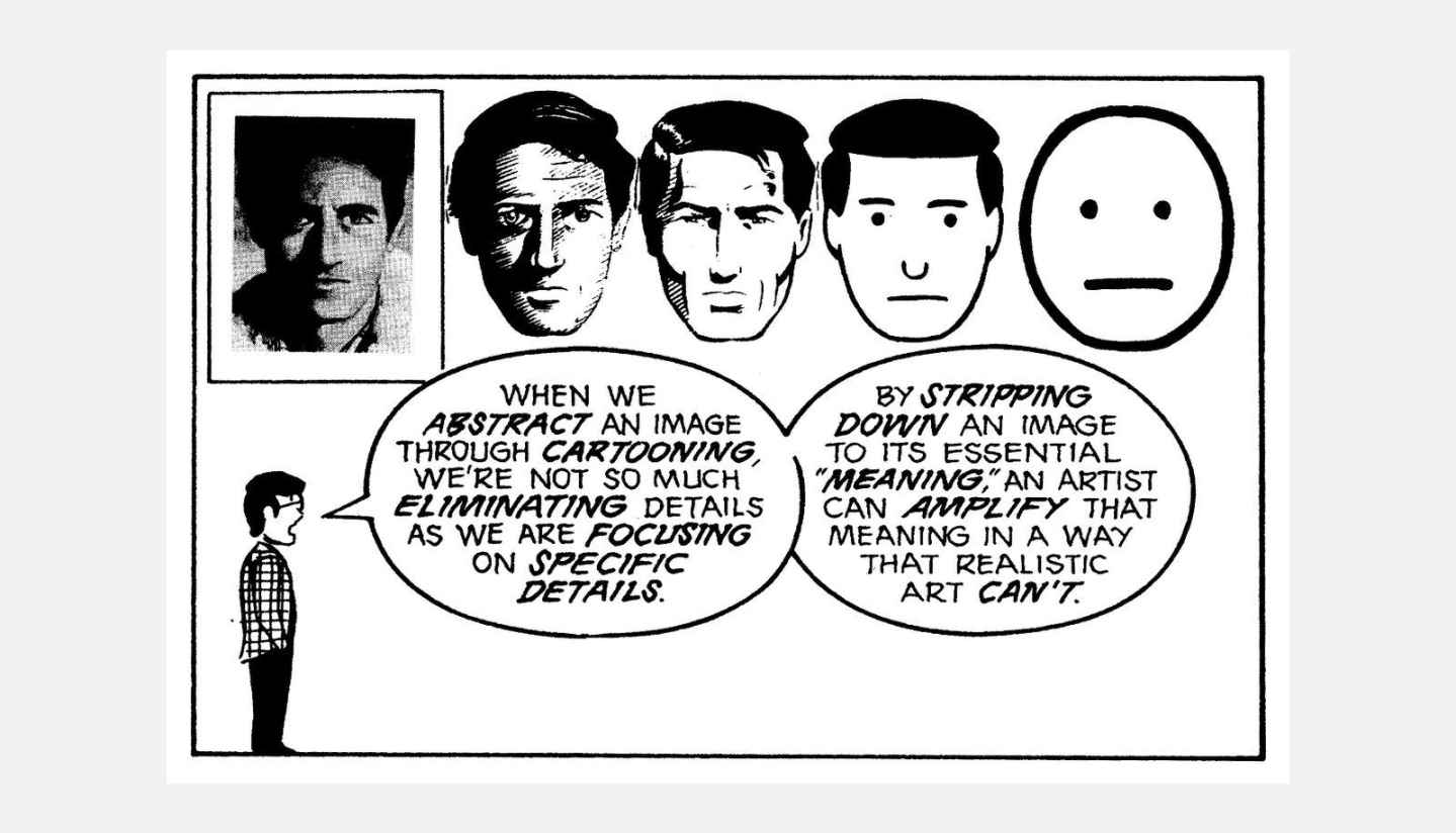
In his seminal work Understanding Comics, author and cartoonist Scott McCloud discusses the power of simplification. Although he’s explicitly discussing icons in relationship to cartooning, the concept is powerful, and you can apply his principles to icon design as a whole.
When we abstract an image through cartooning, we’re not so much eliminating details as we are focusing on specific details. By stripping down an image to its essential “meaning,” an artist can amplify meaning in a way that realistic art can’t.

More complex drawings mean more information to process and a larger cognitive load for the viewer. By focusing on details essential to an icon’s meaning — and ignoring the non-essential details — we can enhance the legibility power of the icon itself. A circle, two dots, and a line are instantly recognizable as a face.

This exercise in simplification has another added benefit. Instead of being a specific face, it’s now any face. We may only be seeing eyes and a mouth, but our minds fill in the gaps with skin, hair, lips, and, more importantly, a real winning personality. Add a slight upward curve to the line, and the face is now smiling. Flip that curve the other way, and now it looks like somebody has a case of the Mondays.

Everything should be made as simple as possible, and no simpler. – Albert Einstein
Jump to Conclusions with Effective Iconography
Choosing details to focus on and which ones to ignore is at the core of icon design. And while deciding which collection of shapes makes a visual metaphor recognizable is not always an easy task, the good news is, we’ve been practicing since childhood.
Ask a kid to draw a car, and they’ll sketch out a box with wheels, headlights, and often a windshield. Those details, the ones that immediately spring to mind, are what make an icon of a car read as “a car.”

This was totally drawn by a kid. (At heart! Ba-dum-dum.)
Sure, you could also add side-view mirrors and a license plate, but at some point, additional elements become flourishes that could detract from the icon’s legibility. That doesn’t mean added elements are superfluous, only that you need to consider the context an icon lives in to see if there is cognitive room to accept additional information.
As a communication tool, an icon should be almost invisible.
A key goal for every icon designer should be to create icons that viewers understand unconsciously. While we’d all love for folks to sit in stunned silence and revel in the masterful construction and beautiful angles of our meticulously crafted automobile icon, the icon’s true job is to quickly and efficiently say “car” and then get out of the way. As a communication tool, an icon should almost be invisible.
Distinctions Between Icons
Two distinct, side-by-side icons need to be immediately distinguishable, so a viewer can parse the differences without thinking about it.

One of these icons is a duck.
But in some cases, you’ll need to add more details to differentiate an icon from something similar. A car icon is distinct from a duck icon. But is it distinct from a bus icon?

In situations where icons share similar characteristics, a one-size-fits-all metaphor won’t cut it. Sure, a car has wheels, headlights, and a windshield, but so does a bus. In this case, start to examine the unique information between your subjects. A bus is taller than a car, its windshield larger, and its general shape bulkier.
A truck is also larger, but the more significant difference is that a truck often has a cargo area, so perhaps instead of a front view, a side view is more appropriate.

There may also be cases when modifying the core icon shape with additional elements can help differentiate it. A truck can become an ambulance with the addition of a medical-style cross or indicate “fast delivery” by adding some whoosh-y speed lines.

Vroom, vroom, Mr. Truck!
Icon Design Considerations and Guidance
The goal of icon design is always simplicity. And you’ll find that subtle variations help amplify meaning and aid understanding. Here are some general tips and tricks to consider:
Unique shapes are easier to read
A unique shape makes it easier to identify an icon quickly. It can help differentiate it from others, which is especially useful in visual interfaces that feature common and repetitive actions.

Additional elements broaden meaning
To bring new or elevated meaning to an icon, add a modifying element. A “speech bubble” icon implies conversation. But modify that same icon with a heart to evoke a warm, loving-kindness.

Yeah, we miss hugs, too.
Additional elements can also help an icon’s specificity. A flame icon indicates fire, but what type of fire? Combine it with two crossed lines (to indicate “logs”), and turn the icon into a campfire. Slap it next to the icon of a dumpster, and you’ve got an accurate representation of the year 2020. (As for this year? We’ll see 2021. We’ll see.)

Subtle adjustments can convey movement
Another way to differentiate between similar icons is by implying movement. A head, two arms, and two legs read as a “person” icon. Add joints and angles to the same elements, and you’ve got a speed walker. The same basic building blocks (head, arms, legs) arranged in a different formation bring different meanings. Angles and design elements become key considerations to building an effective icon.

When to Cut “Flair” From Your Icons (and When Not To)
Hitting that icon design sweet spot between simple and effective is an art. On the one hand, specific details could create more interest, but it’s helpful to ask: can the icon communicate with fewer flourishes? If you’re not sure, back up and consider the 5 W’s again.
Get ruthlessly “Office Space” on the unnecessary details, but remember, a little flair can be useful. And once you’ve found the core design of your icon, have fun with it!
How about you? What common usage icons strike that sweet-spot balance of effectiveness and flair? Let us know what you think on the Twitters!


