In the first Designing Icons article, we kicked things off with a general overview of icons and their role as a communication tool. In this round, we’ll talk about the factors surrounding when we interact with icons. In other words, when it comes to building and choosing icons, context is king.
How I Learned to Stop Worrying and Love the Bomb…
While iconography is ubiquitous, it’s not always “universal”. Meaning can vary wildly from culture to culture, or even from industry to industry, so you’ll have to think through how to choose the right visual metaphor.
When you decide to use an icon, you need to consider who interacts with it and where. Are you communicating to a kindergartner or a nuclear physicist? Are they sitting in a greasy spoon diner perusing a menu, or at the airport frantically looking for a bathroom? Are they checking their email inbox, or is their vintage Macintosh about to explode? (No need to duck for fear of computer shrapnel just yet, friend. All will be made clear soon enough…)
What We Can Learn From the AIGA and DoT
Traveling abroad doesn’t require expert, local language skills to understand that an arrow next to an airplane icon points the way to the airport. We know what an arrow means, and if drawn even somewhat legibly, we can usually recognize a simplified airplane. But this wasn’t necessarily always the case. In fact, a partnership between AIGA (at the time, an acronym for the American Institute for Graphic Arts) and the U.S. Department of Transportation helped define this shared visual language.
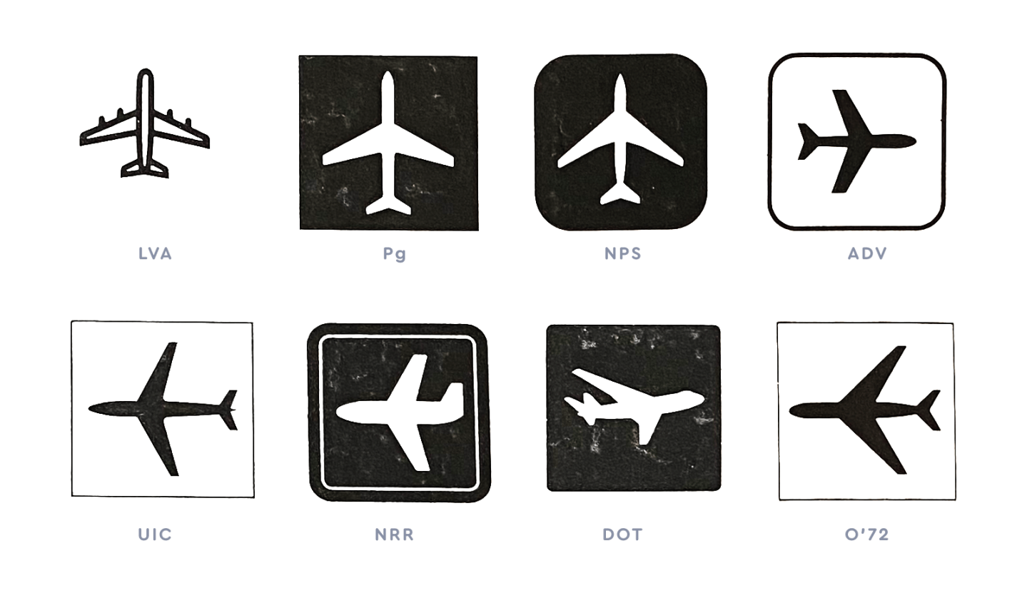
Inventory of airplane symbols used in transportation.
In 1974, they worked to compile an inventory of travel symbols used throughout the world. This resulted in recommendations and standards for transportation-related icons. As part of the study, they found that icons work best when the service they are representing can easily be connected to an object, such as a bus or a bar glass.
On the flip side, icons are “much less effective when used to represent a process or activity such as Ticket Purchase, because these are complex interactions that vary considerably from mode to mode and even from carrier to carrier.” (Symbol Signs, Hastings House, 1981). Not to mention from culture to culture.

A bus, a cocktail glass, and some amazing close-up magic.
Icons work best when the service they are representing can easily be connected to an object, such as a bus or a bar glass.
The AIGA and DoT partnership is a good lesson in how to approach effective icon design. Their goal was to facilitate passenger and pedestrian orientation at transportation-related facilities worldwide. But the context that every icon lives in is different and calls for different kinds of nuances. Here are a few guideposts for how to think through approaching your design.
5 Ways To Understand Your Icon Audience
Whether you’re designing a new icon set or using an existing library, the visual metaphors you select for a project need to be legible (or at least learnable) to your intended audience. And to know your audience better, you’ll need to do a bit of research. Not sure where to start? Put on your journalist hat and start with the 5 W’s.

1. Who is your audience?
You can’t always control who interacts with your icon. But getting clear on the intended audience helps you serve them with useful information they can act on. Are you creating an app primarily intended for young children, or are you designing an interface used at a nuclear power plant? The former can easily identify an apple icon, but likely has no understanding of a radiation symbol. Not only that, but there’s more room for whimsy in one of the prior examples (we’ll let you decide which).

2. What idea are you conveying, and is it new or familiar?
Choosing a metaphor to represent your daily step count is easier than choosing a metaphor to represent augmented reality. We know a trash can icon typically means “delete” or “throw out”… but what does a cloud icon mean? It’s important to research the cultural history of a specific icon to see if there is a visual legacy at play, or if the concept is new and unique.

3. Where is the icon being observed?
Knowing the context in which someone sees an icon is important, too. For example, you can “turn on” both an automobile AND a stovetop. An icon of a key might be appropriate for one, an icon of a flame for the other. There can be different expectations based on an icon’s location or circumstance.

4. Why is an icon being used?
In the AIGA/DOT study, they found that it could be harmful to overuse symbols and icons. “Only those messages that are truly essential should be considered.” Adding an icon for icon’s sake is never a good idea. They should be added to enhance legibility, not detract from it. A sign pointing to a café could use a simple coffee cup icon, but you don’t necessarily need icons for all the types of food they serve.
5. When is an icon being seen?
Or, put another way, how much time does the viewer have to interpret the icon? Someone perusing a movie reviews website likely has more time to decode an icon than a motorist does to understand an icon on road sign.
Choosing Icon Metaphors
Once you have a clearer idea of who your audience is, it’s time to grab your fa-binoculars and start looking at the use of icons based on “where” they are or “what” they’re aiming to accomplish.
Imagine a job board website. You could use the icon of an office building to indicate an onsite position, and a house to indicate a job that allows working from home. Or you could use the icon of a satellite to imply “remote” work, or a no-pants icon to give a new definition to “business casual.”


We’ve got one requirement, and it’s pants. Or not.
Imagine a rushed traveler at an airport. They’ve just landed and need to make it to a departing shuttle, but first, they need to use the bathroom. An icon of a toilet points the way to their first destination, that of a car and bus points their way to the second. After they’ve seen the icon once, it’s easy to follow along with the wayfinding directions.
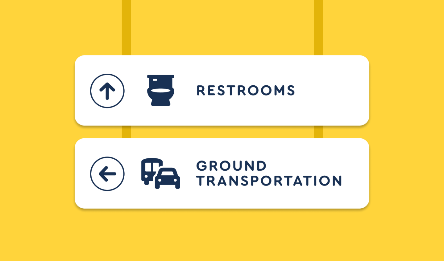

Icons like these have become ubiquitous at airports around the world.
Imagine a new email app. Folks who use email understand the expected functionality of inbox, drafts, replies, and the like. (It’s worth noting that these concepts themselves are digital analogues for sending actual, physical letters). It makes sense in this case to use icons that are “tried and true” in the context of email. An icon of a physical “inbox” to represent an inbox. An icon of an envelope to represent a message. But there’s room for some playfulness here, too. A lot of modern email apps use a “paper airplane” icon to represent sending a message.
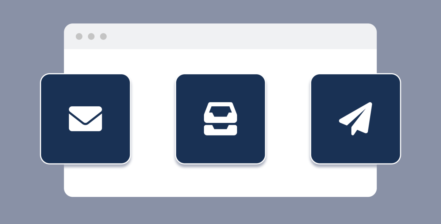

Some common email-relate icon metaphors.
Imagine a parking garage at a zoo. Each floor of the parking garage could have a designated icon. Floor one is an icon of a lion, with perhaps a yellow scheme. Floor two is a bear, with a blue palette. In this case, the icons are serving as visual markers. They’re meant to help you remember where you parked. The level of detail is almost arbitrary, as long as the icons are recognizable and memorable. These same icons could then be repeated in the garage elevator and associated signage. The metaphor here relates to the overall theme of the environment but is only loosely tied to the thing it represents.


Some icons you might see in a zoo parking garage. If you see an actual monkey, however, we might suggest calling someone. Because, you know… they like to throw poop.
Uniqueness in Icon Design
Some of the most fun icon metaphors invoke a feeling, instead of literally translating what’s happening or meant to happen. If you used computers throughout the 80s and 90s, you’re likely familiar with the work of designer Susan Kare, who was mostly responsible for the early interface icons used on Macintosh Computers.
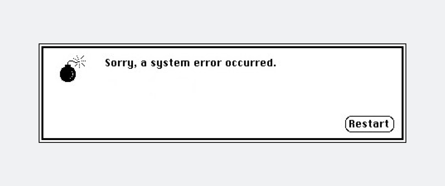
If something went wrong while working on a legacy Mac, an ominous system error message appeared. The message was simple: “Sorry, a system error occurred”. The alert box also contained a single icon, a cartoonish bomb, complete with lit fuse. The idea was clear. Something bad had happened. Was your computer actually about to explode? No, of course not. But the idea couldn’t help but make you smile, and was a perfect fit for the inquisitive and adventurous audience of early computer users. And for some, it inspired a career in icon design itself.
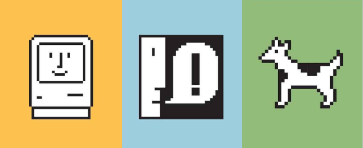
Susan Kare’s work is the epitome of fun and function.
When appropriately used, icons are important tools that facilitate the exchange of concepts and ideas. In our upcoming articles, we’ll talk more about how icons work, the importance of style and visual consistency, and we’ll get into the details of actually designing icons from scratch.
In the meantime, take a look around you. What’s your process for identifying your audience, and what icons are “the bomb” in your book? Let us know what you think on the Twitters.
Biased about what makes for an awesome icon? Us too! Well, we’ve got good news — Kit Icon Upload is now available to all Font Awesome Pro subscribers as a beta, so you can augment Font Awesome with your very own icons.
Upload your own icons with Font Awesome Kits!


