In our Designing Icons series, we’re talking about the basics of icon design. Get up to speed by learning about the history of icons, how context is king, and why simplification works. This article will explore the basic elements of icon grids and how an icon grid can help ensure quick and consistent design.
It’s so fine and yet so terrible to stand in front of a blank canvas. – Paul Cezanne
Don’t Panic. – The Hitchhiker’s Guide to the Galaxy
As many designers and artists can attest, a blank canvas represents endless possibilities. There’s no limit to what can fill that space. And that can be equal parts exciting and paralyzing. With so many directions a design can take, where do you begin?
The easiest way to start filling a blank canvas is by adding predefined constraints that give you limits to work within. In icon design, one of the most useful constraints is the icon grid.
What is an Icon Grid?
An icon grid is a canvas we use to design icons. It’s a simple network of horizontal and perpendicular lines that provide literal guidelines for drawing icons. Icon grids define an icon’s size and dimensions while providing key shapes and secondary constraints to ensure consistency.
An icon grid ensures quick and consistent design and allows you to:
- Establish consistency across your icon family
- Set guidelines and default shapes
- Create pixel-perfect icons
One needs only to look at trail-blazing designers like Otl Aicher and Susan Kare to see how important grids can be for icon systems. Though the technology we use today is more advanced, Kare and Aicher set the stage for not only how we scale iconography but for how to approach effective design through the lens of minimalism. The standards they defined are still being used by designers today.
1972 Olympics: The Standard of Icon Design Consistency
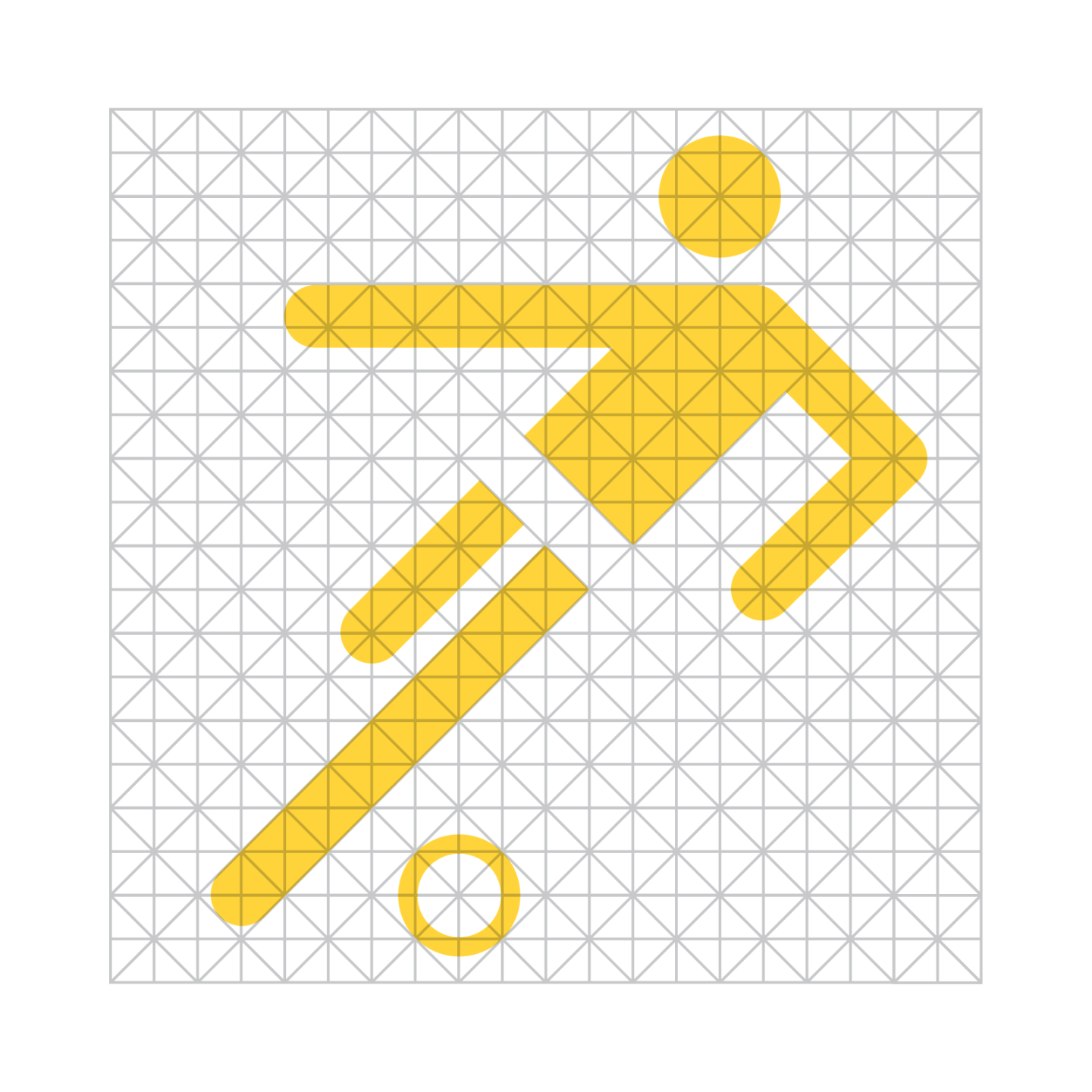
Otl Aicher set the standard for modern symbols and icons with pictograms designed for the 1972 Munich Olympics. Otl created a grid system for his icons, which kept the designs consistent while providing a unique and dynamic visual style. In the pre-digital design world, Otl’s icon grid allowed others to easily resize and scale his designs for use on signage, posters, and more—without losing clarity or quality.

1980s Macintosh Interface Icons: Creativity within Constraint
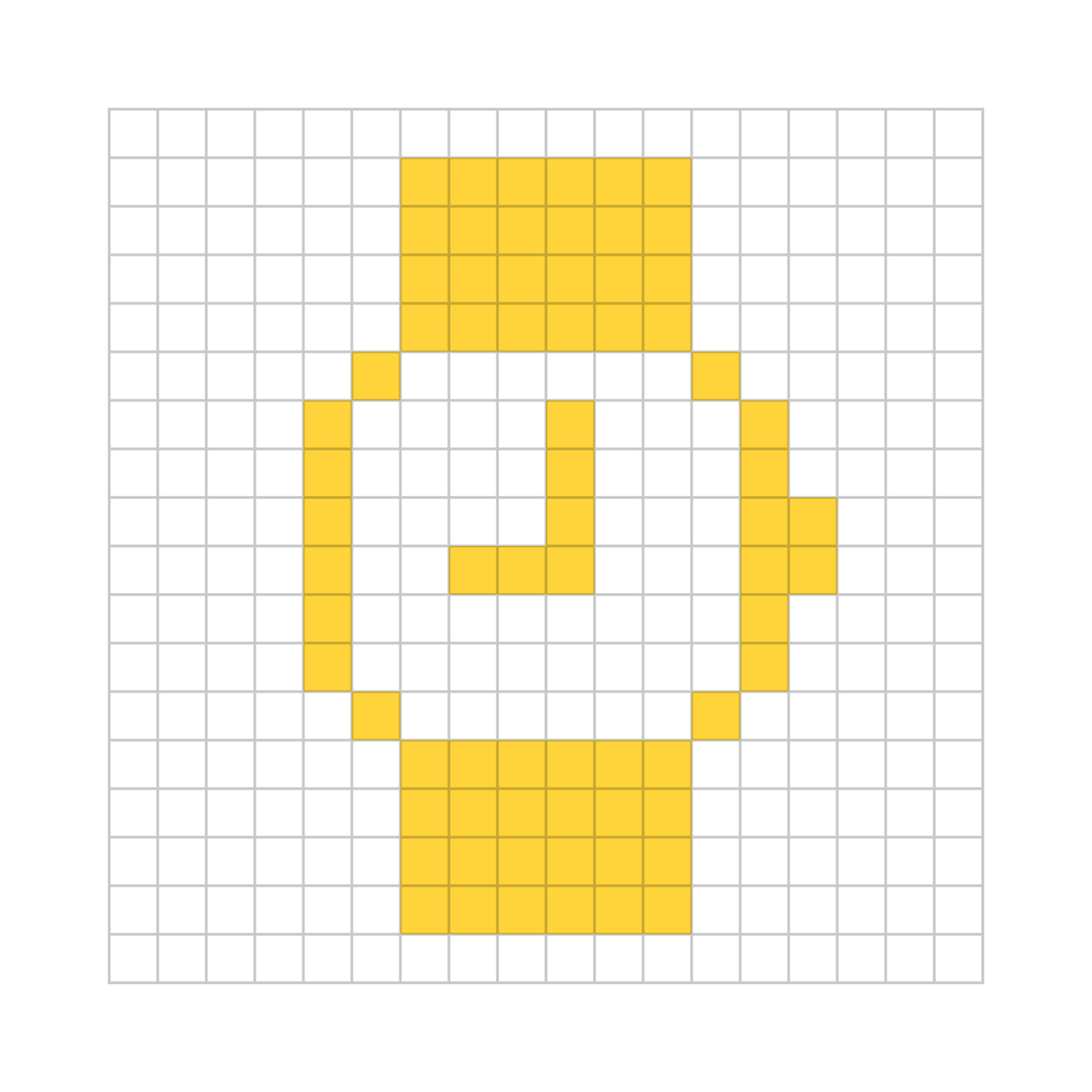
Susan Kare’s work on the early Macintosh interfaces is the definition of creativity within constraint. Limited to a literal 16-pixel canvas and a single color, she often employed graph paper to work out her designs. Because users viewed icons on low-resolution computer screens, she relied on simplicity, so the icons remained legible at their native small sizes.

Modern Iconography and Tools for Consistency
Today, icon designs must often live in both the real and digital worlds. They exist on computer screens, mobile devices, product packaging, vehicle dashboards, wayfinding signage, and more. Modern design programs allow us to build our icons using vectors, which makes resizing and scaling a trivial task at best. The newest displays are such high resolution that viewers rarely see individual pixels. But icon grids continue to be one of the essential tools of our toolbox.

5 Elements of an Icon Grid
Now that we all agree that icon grids are the best thing since a sliced bread icon, we’ll break down their elements.

ICON CANVAS
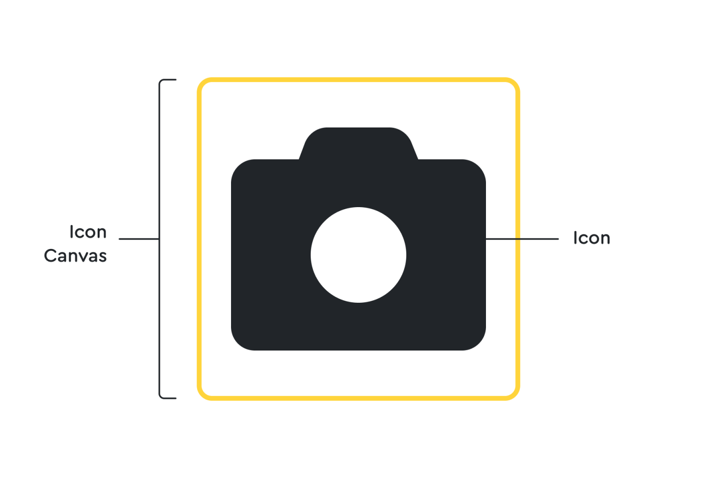
You can’t have an icon without a place to put it. (Well, you can, but it’d be lonely.) Whether you call it an artboard, a frame, a view box, or simply “Bob,” the icon canvas is the containing element for your icon design. In the examples below, we’ve set a canvas size of 20 pixels square. But canvas size can vary depending on the requirements of your icon set. (At Font Awesome, we use a slightly modified canvas of 20 pixels by 16 pixels.)
Icons that aren’t contained on a canvas, or extend beyond a canvas’s edge, run the risk of being cropped or misaligned.

ICON GRID
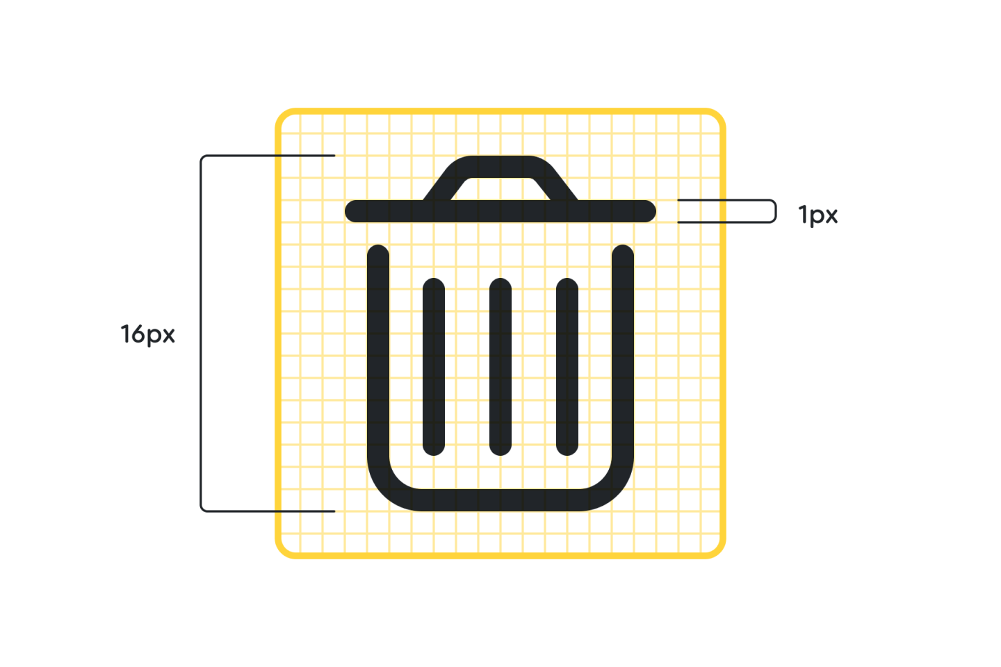
The icon grid provides a structured base for your icon. For interface design icons, your grid is synonymous with a pixel grid — which means that each square of the grid maps directly to a single pixel on a computer screen. By aligning your icon directly to the gridlines, you’ll ensure the design remains crisp. (Most design programs will allow you to “snap to grid” while designing, which makes your job easier.)
When creating icons for environmental designs, it may be easier to set up your grid using different units of measurement such as inches, centimeters, or sheppeys. But for good old-fashioned screen design, we typically stick to pixels.
ICON GUIDES
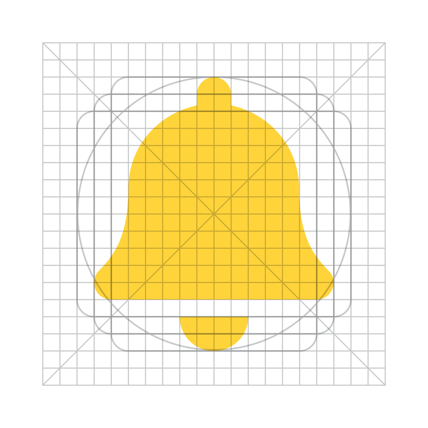
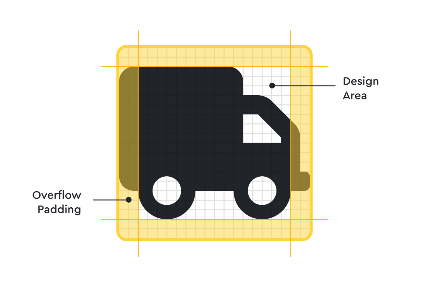
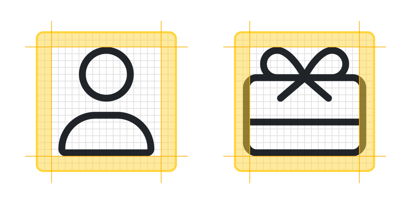
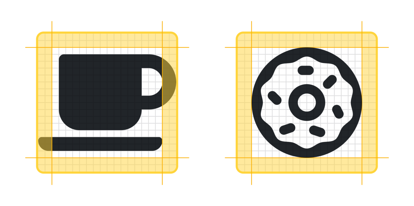
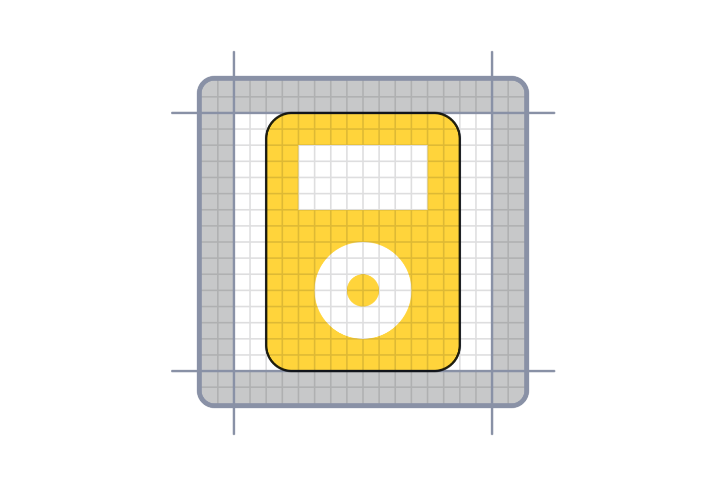
Setting basic guides on your icon canvas allows you to set outer limits on your icon’s size. While most icons will fall within the design area (or “live” area), the extra overflow padding allows for wider icons while retaining density and optical weight. The design area is 16px with a 2px overflow padding in the example below, allowing for a maximum icon size of 20px.
ICON KEY SHAPES
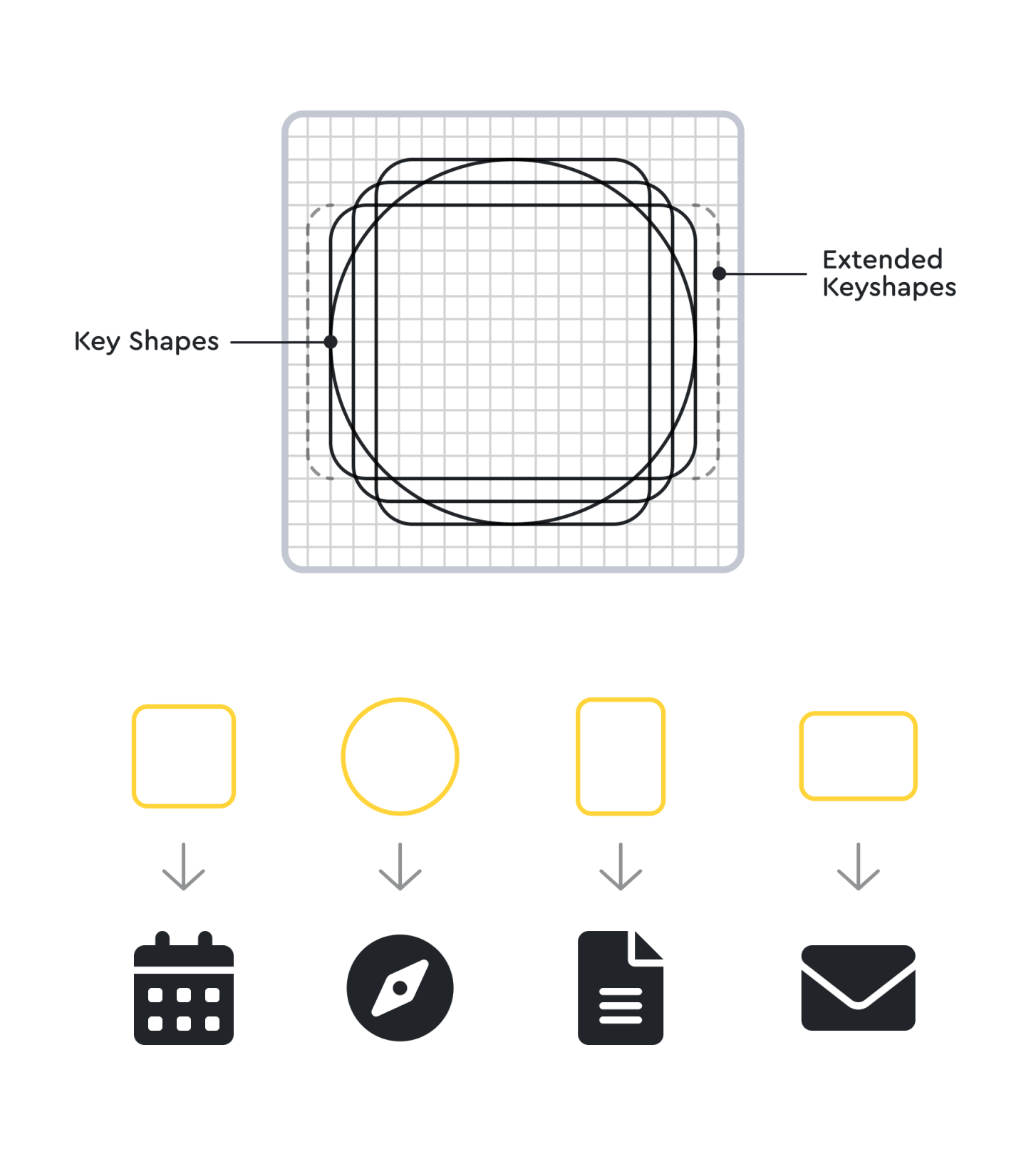
Key shapes are predefined objects that have been tested and vetted for sizing so that each icon takes up a similar amount of volume on the page, regardless of its overall shape, which helps ensure that your icons retain a similar optical weight. In other words, they all “feel” the same size, regardless of their actual dimensions.
Though “eyeballing” these shapes is a reasonable choice, there’s actually a bit of math involved, too. Each shape has different dimensions, but they all have a similar volume. A 12 pixel by 16-pixel rectangle has a volume of 192, whereas a 14 pixel by 14-pixel square has a volume of 196.
Use key shapes as the basic building blocks for your icon designs. The standard shapes are a circle, square, and rectangle, but your needs may vary.

ICONS
The final and most important element of an icon grid is … you guessed it … an actual icon. As the old saying goes, you can’t make a grid without first cracking a few icons. Or, um, something like that.
So grab that icon canvas, slap on your oh-so-special icon grid, layer it with some guides, and lovingly sprinkle in some key shapes. It’s time to make the icons™.
Making Your Own Icons
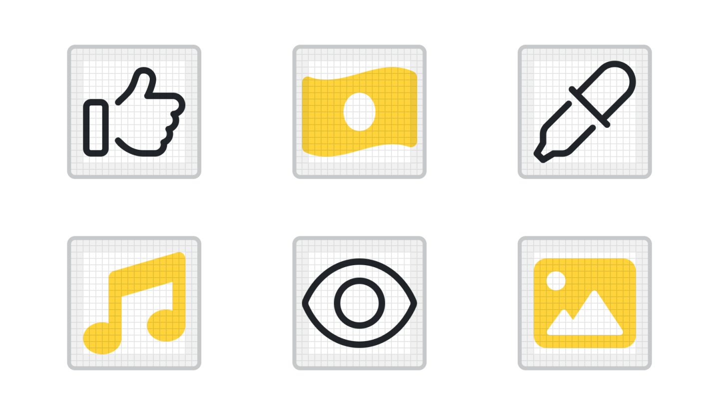
Ready to dive in? Use these icon templates as a starting point for your new icon designs! And keep an eye out for our upcoming articles where we’ll explore the anatomy of icons and how icon style can benefit your overall brand.
Icon Design Templates:
And we’d love to see your creations! Share them with us on Twitter, and serve them up to your favorite website using Font Awesome’s Kit Icon Upload. (Pssst … you’ll need a Pro Plan for this!)
