Font Awesome
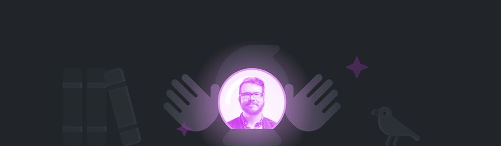
At Font Awesome we take pride in working with the very best people we know — not only those with top-tier professional skills but the kind of quality human beings we want to work with everyday. That’s why we’re so thrilled to have icon designer extraordinaire Noah Jacobus on the Font Awesome team!
In this Nerd Show and Tell, Noah tells us about the monumental task of creating the upcoming Font Awesome Sharp icon family and shares his love of minimal, retro-styled games.
What’s your professional background, and what’s your role at Font Awesome?
Hi! I’m Noah, a Senior Icon Designer here at Font Awesome. I’ve been drawing very small pictures for as long as I can remember but have only been professionally designing since 2009 or so. I got my start in branding and print design, then eventually convinced my last previous gig at MetaLab to let me specialize in iconography full time.
What have you been working on lately?
I’ve been chipping away at the monumental task of sharpening all our icons! This is an ongoing process and will take multiple splits to get out the door, but it will effectively double our icon count and set the stage for some really cool stuff coming later.
Are there any particular challenges you’ve faced as you create all the Sharp icons?
When you’re recreating 16,000+ icons in a new style, lots of interesting little puzzles crop up. Often, it’s as simple as removing the rounded corners and stroke terminals, but sometimes it requires a complete redraw as we consider how this will impact all 5 of our icon styles.
It’ll be great to offer the same Font Awesome icons you know and love, but with a totally new and crispier vibe.
Are there other icon designers you’ve been paying attention to lately?
There are lots of great icon folks to keep up with — like Bonnie Kate Wolf, Martin David, Laura Bohill, Zach Roszczewski, Helena Zhang, and Laura Reen. Not to mention the wild and beautiful world of mobile and desktop app icons from Prekesh Chavda, Gavin Nelson, and Michael Flarup (check out his new book!)
What caught my eye most recently was actually Google’s work creating variable glyphs for their Material Icons. Really fascinating stuff!
What icon pack needs to make it into the Font Awesome canon?
It is an egregious and despicable crime that we don’t have any dinosaur icons. If there’s no other remnant of my legacy at Font Awesome when my time has gone, there will surely be some new li’l prehistoric buds.
Where all great icon ideas come from.
What are some of your favorite icons?
If we’re talking icons of all time, I don’t think you can beat Susan Kare’s work for the original Macintosh. So much of what she did set the standard for UI iconography for decades to come.
If we’re just talking about Font Awesome favorites, then it’s gotta be clarinet (my instrument for 15+ years) or book-skull (my preferred method of getting back to the S-Mart housewares department).
What’s the crappiest job you’ve ever had?
During high school, I had a gig staining cedar roof shingles in an unventilated garage. Not sure which was worse: the fumes or the constant country music.
What have you been nerding out about lately?
Lately, I’ve been really into retro gaming and its influence on modern games! Seeing rad new devices like the Playdate and developers like Yacht Club Games combine design constraints from the past with current technologies is super inspiring.

Noah knew this li’l yellow bud would be a good warmup to familiarize himself with the different icon styles.
Can you say more about the positive aspects of design constraints?
When it comes to design constraints, I really believe that imposing limitations on yourself is one of the most valuable things you can do in icon design (or most design, for that matter). Not only will it save a lot of headaches down the road if you understand and plan for them, but it allows creativity to flourish once you’ve narrowed your scope. It really helps mitigate that “blank page paralysis” when starting something new because a lot of decisions have already been made.