Jory Raphael
That rug really tied the room together.

The new Font Awesome flag (right) is an evolution of our existing mark (left).
Welcome to another blog post about a logo update. In the paragraphs that follow, you’ll read such words as evolution, modern, and brand-spanking. (That’s how you know we’re legit.)
But first, some history. Way back in 2006, a bright-eyed Dave Gandy made his way across a wintery-patch of Harvard Yard and stumbled upon something magical. Behind a small tree in front of a dormitory was a large structure made entirely from taped-together cardboard boxes. Spray-painted across the front of this creation were the words “FORT AWESOME”. And indeed, it was an awesome sight. A sight that remained in Mr. Gandy’s mind, and on his camera roll, for another six years. In 2012, that memory found a new home in the name of his newly created icon-based font: Font Awesome.

The only thing missing is a flag.
The first version of Font Awesome was not overtly branded. It had a name, but no official logo. As a small project, that wasn’t a huge issue, but there was occasionally the need for something visual to represent the icon font. Luckily, there were a lot of, well, icons to choose from. And as Dave combed through the first batch of icons, he was reminded of the fortification in Harvard Yard. As the wind nipped at his ears, he’d imagined a flag rippling above those majestic cardboard ramparts. As luck would have it, Font Awesome already included an icon of a flag.

Variations on the Font Awesome flag throughout the years.
The flag icon was used as the unofficial logo for versions 1 through 3 of Font Awesome. But that logo was also the same flag embedded within the icon set itself. Anyone using the flag icon was, in a way, also using our logo. Which was cool. But also kind of, not cool? As Font Awesome transitioned from an icon font into an actual company, a new version of the flag was introduced.

Version 4 of Font Awesome was the first to have an official logo.
With version 5 of Font Awesome, a wave returned to the shape, and a bounding box was included to add balance.

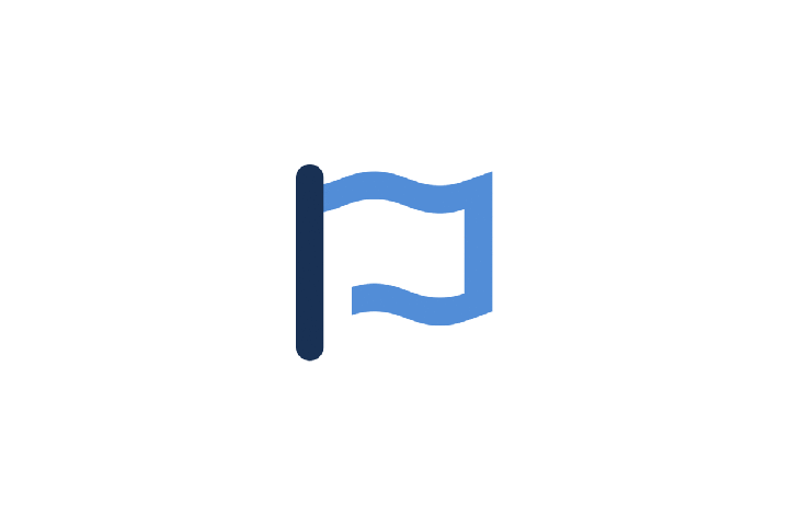
The current Font Awesome logo.
Which brings us to today. The Font Awesome team has grown, the icon font has evolved to include svgs, and we’re on the cusp of releasing the next version of our icon family and toolkit. As we envision the future of both our company and our icons, one of the most important things for us has always been to build upon what works and revisit what doesn’t. From an icon standpoint, that means updating icons, creating new styles, and refreshing our overall look. From a logo standpoint, that means evolving our current mark into something more flexible and modern.
Which brings us to:
The Brand-Spanking New Font Awesome Logo

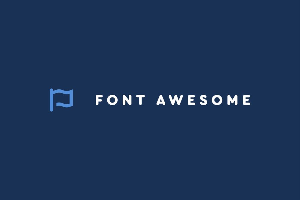
The new Font Awesome logo features an evolution of our flag mark, a new typeface, and wider letter-spacing. It’s been designed to work well at small sizes, and is flexible enough to support multiple layout configurations and color combinations.

Look, ma! Our logo is responsive!
One of the most important considerations when designing the new logo was to ensure that the flag itself could live on its own, outside of any bounding shapes. It was also key to simplify it as much as possible, while keeping it recognizable as a flag.

The updated flag plays nicely with our new Font Awesome 6 icons.


The new mark features only 22 vector points, and was built on the same 16px grid that we use for all of our icons.

At its native size, the strokes in the flag are all 2 pixels.
The simplicity of the new mark actually allows it to be more complex. By allowing variations and additions we can adjust the flag to represent different moods and themes.

Some of our updated color palette.

Ever wish you could drink an icon? We put the logo on a beer can mockup, because we’re very serious designers.

A pattern made using the “wave” element from our flag.
We’re excited to start using the new logo, and you can expect to see it rolled out as we prepare for the release of Font Awesome 6. It’s a logo we hope will last us for the long haul, and a logo that we hope honors the legacy of what came before. And who knows, if you squint hard enough, you might even see it sitting atop a cardboard fort, rippling in the wind.