![How to Build and Style Your Visual Design System [Part III]](/img/built/4LoGFZlXiE-2000.jpeg)
 Lindsay Miller
If Part 1 was the pitch and Part 2 was the parts list, this is your build guide. We’re getting hands-on — auditing what you’ve got, defining what you need, and laying the groundwork for a system that actually scales.
Conduct a Visual Audit
First, start with a visual audit. Assess your current design elements to see what’s working, what’s not, and where there’s room for improvement. This step is crucial for aligning your visuals with your brand’s goals.
To check your company’s visual style, follow these steps:
- First, make a list of all the pictures, colors, and designs you use. This helps you see what you have.
- Then, look at how these elements appear on different devices so you can spot differences. Figure out what looks good and what needs work in your brand’s style. Ask for opinions from non-design folks in your company to hear different views. Look at what other companies in your field are doing to see how you compare.
- Lastly, use what you’ve learned to set clear goals for making your visual style better and better over time. With your visual audit complete, you’ll need to define the core elements of your design system.
Define Core Elements
Next, choose a color palette that speaks to your brand and choose fonts that convey the right personality. These choices lay the foundation for your visual language.
Color
Keep accessibility in mind from the outset. Colors are hardly effective if they can’t support readable, meaningful pairings. Anticipate which colors may be used together and prepare to check their contrast ratios and adjust as necessary. Grab your favorite contrast tool, like WebAIM’s WCAG 2.1 contrast checker, and set forth!

Choose a primary brand color. This is the essential color that defines your brand’s personality and promotes brand awareness, like Netflix’s red or Home Depot’s orange. From this color, derive a few lighter tints and darker shades so that you have the flexibility to pair your brand color with other colors while ensuring readable contrast.
Choose a neutral color to serve as a sort of canvas for your product, again with a few different tints and shades. Generally, these colors will be largely unsaturated and gray, but different products and audiences might warrant something bolder! Taking cues from the 60-30-10 rule of interior design, these colors account for 60%, or a large majority of, your web application, allowing your branded or semantic colors to grab attention. The tints and shades of your neutrals should always offer good contrast with other colors in your product.
Choose any necessary semantic colors. These colors convey specific meaning to your users, such as red for error states, green for success, and yellow or orange for warning. Depending on your needs, it’s generally a good idea to have tints and shades of each semantic color that can be used for backgrounds, icons, and text against your neutral colors.
Choose any number of accent colors for your brand. How many and what kind depends on the tone and attitude you want your product to have. Many products stick with just one brand color and their semantic colors, which allows the product to focus on clarity and usability. Other products employ a rainbow’s worth of accent colors, which can create high visual interest (though be careful not to hinder readability). Additional subtle, analogous colors can make your brand feel refined or pastoral, whereas louder, complementary or triadic colors can make your brand feel dynamic and exciting. Different strokes for different folks!
Circle back to accessibility. Falling in love with a color only to learn that it doesn’t offer great contrast is a unique kind of disappointment. (Believe me, it’s brutal.) But that doesn’t mean you have to kick it to the curb. Take stock of all of the colors in the palette you’ve created and decide on how they should be used in your product. One pairing might work well as paragraph text on a tinted background, while a lower contrast pairing may be well suited for a flashy, bold background with large text.
Typography
Choose a font (or two) that conveys the tone of your brand. If your brand’s font is especially unique, consider reserving this font for headings or other eye-catching text. For your body text, you’ll want a highly legible font for easy reading.
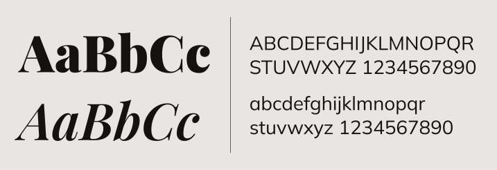
Choose font weights. Loading every possible weight from thin to black won’t make your site very performant. Decide on a few, distinct font weights that you can use to give different emphasis to your text. Variable fonts can make managing font weights especially easy: these fonts combine multiple weights into a single file, reducing its file size and making it a cinch to choose different font weights later if you change your mind.
Choose font sizes. Typography is key to establishing hierarchy in your content. Font size, in addition to font weight, plays a huge role in this hierarchy. You’ll want enough font sizes to cover different heading levels, body text, and supplementary details. Choosing a consistent ratio between font sizes, otherwise known as a typographic scale, can help ensure there’s enough variation in font sizes so that they’re easy to distinguish, all while maintaining a pleasing visual rhythm.
Spacing and Layout
Consider information density. Think about how folks use your product. Do they often need to scan or compare a lot of data? Do they read a page linearly with the goal of absorbing and retaining information? Your users’ goals should inform how densely you pack information on screen. A sales dashboard or an email application, for example, might warrant higher density than marketing materials or an onboarding flow. Once you determine how dense your product should generally be, the spacing rules in your design system should follow suit.
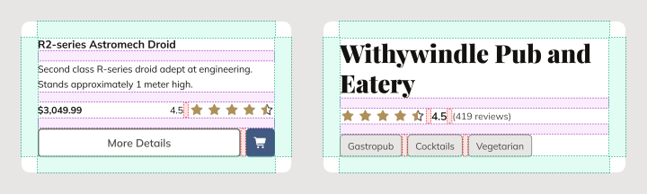
Choose a spacing scale. There isn’t a right or wrong way to codify spacing in your design system. Whether you like a linear scale (8, 16, 24, 32, etc.) or a geometric progression (8, 16, 32, 64, etc.), it’s all good! What’s important is that your scale is consistent, easy to design with, and creates a pleasing rhythm that works well for your users’ needs. Here’s a tip: Don’t have so many spacing values that it’s impossible to choose between them. Choosing whether there should be 8px or 16px between elements is much easier than choosing between 8px and 10px.
Establish responsive layout principles. Your product should be able to adapt to any device and screen size. Media breakpoints, grid systems, and intrinsic sizing are all options for supporting usage on anything from a smartphone to a television. Just promise us you won’t remove functionality on mobile; for many people, smartphones are their sole means to access the web.
Craft a Visual Language
Crafting a visual language involves creating guidelines for imagery and graphics. These guidelines ensure cohesive storytelling across all platforms, reinforcing your brand’s identity at every touchpoint.
Examples of a visual language may include:
- Illustration guidelines
- Photography style guide
- Data visualization standards
- Animation principles
- UI component design rules
- Brand voice and tone guidelines
Lastly, even though it’s not about looks, include rules for how your brand should sound in writing. This helps unify your content by giving everything the same voice.
Fun fact: Studies have shown that incorporating elements of controlled chaos or asymmetry in visual design systems can actually increase user engagement and brand recall. This phenomenon, known as the “Von Restorff effect,” hints at the idea that slightly breaking visual patterns in strategic ways can make certain elements more memorable, adding a dynamic edge to your design system without compromising overall consistency.
With your color palette locked, your type scale set, and your spacing rules established, you’ve got the bones of a real design system. But there’s one component that deserves its own conversation — one that’s deceptively simple on the surface and surprisingly deep once you get into it. We’re talking about icons. See you in Part 4.


![How to Build and Style Your Visual Design System [Part III]](/img/built/4LoGFZlXiE-1000.jpeg)