![The Building Blocks of a Visual Design System [Part II]](/img/built/7BeCA6B3bh-2000.png)
 Font Awesome
Welcome back. In Part 1, we made the case for why a visual design system is worth caring about. Now it’s time to get into the actual stuff — the design system components that give your system its look, feel, and staying power.
So. Onto the design system components that make up the ingredients of a design system.

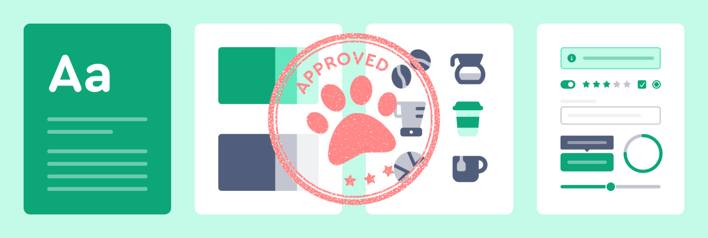
The key design system components include:
- Color Palette: Primary, secondary, and accent colors
- Typography: Font families, sizes, and hierarchies
- Iconography: Style, usage guidelines, and custom icons
- Imagery: Photography style, illustration guidelines
- Layout: Grid systems, spacing rules, and responsive design principles
- UI Components: Buttons, forms, cards, and other reusable elements
Once you have the basics of a design system nailed down, it’s important to maintain consistency across your entire brand.
The Power of Consistency
Think about the most successful companies; their visual identities are instantly recognizable. Here’s a little anecdote to underscore the point.
I have a loveable — but not particularly smart — Shi-tzu. And he loses his ever loving mind for pup-uccinos at Starbucks (a tiny cup of whipped cream). I’ve noticed on more than a few occasions that when we walk by a Starbucks, he wags his tail so hard that I start getting anxious that a doggie chiropractor bill may be in my future.
Now keep in mind, I wasn’t exclaiming to my dog that a pup-uccino was coming his way. But he either sees the sign or smells the coffee and he knows something good is imminent. I’d venture to guess that my dog has a nose for Starbucks and the cue probably isn’t the visual logo. But the point is, brand consistency ensures that every interaction with your brand is familiar and trustworthy. And if a dog can be trained on the consistency of experience, so can people.
This amusing anecdote illustrates a crucial point about the power of consistent branding. Let’s delve into the advantages of a consistent brand identity and see how it translates to the digital realm.
A consistent brand identity offers lots of pluses in the digital realm. It reduces cognitive load for users, making it easier for them to navigate and interact with your digital products. Consistency also increases brand recall and loyalty, as users become more familiar with your visual language. It also improves user interface learnability, allowing users to quickly understand and navigate your digital platforms. Ultimately, these factors contribute to enhanced overall user satisfaction.
Why Visual Design Systems Matter
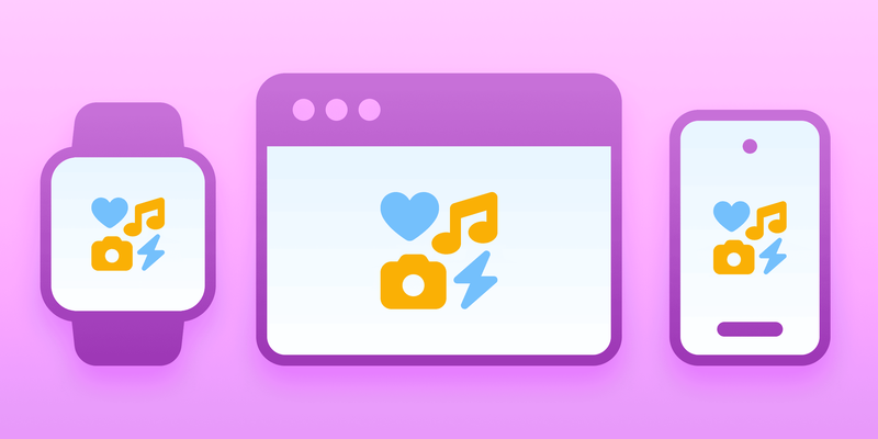
There are many different types and sizes of digital devices. A good design system works well on all of them, making sure users can easily understand and use the product no matter what device they’re on.
When creating design systems, tech companies need to solve several problems related to making their products work on multiple devices. These include:
- Making sure the content looks good on all screen sizes
- Accounting for device interaction (like touching a screen vs. using a mouse)
- Making the product run smoothly on devices with different capabilities
- Ensuring the product is usable for people with disabilities across all devices
Solving these problems is important to give users a similar, high-quality experience no matter what device they use. Beyond the nuts and bolts of responsive design lies the art of visual storytelling.
Branding Beyond Words
Visual elements communicate brand values in ways words alone cannot. Believe it or not, visual elements can evoke the feels — subtle though they may be — create connections, and make your brand memorable. A strong visual design system ensures these elements are always aligned with your brand’s message.
When designing to make people feel something, there are lots of considerations. Colors can affect how people experience your brand. Where some colors might make people feel calm, others might make them feel excited. Using pictures, symbols, or icons that represent ideas can help explain things quickly in a way people will remember.
When your customer engages with your product, maybe you’ve included small, fun details that show off your brand’s personality and make the experience more enjoyable, and keep users interested.
You’ve got the design system components in hand Now let’s talk about what to actually do with them. In Part 3, we walk through a step-by-step process for auditing your current visuals, defining your core elements, and building a system that holds together under real-world pressure.
![The Building Blocks of a Visual Design System [Part II]](/img/built/7BeCA6B3bh-1000.jpeg)