Matt Johnson
Breakin’ the law, breakin’ the law!
A symbol’s efficacy changes over time, but what happens when an everyday use icon sends the wrong message? You get all Judas Priest on the powers that be and go breaking the law. Kind of.
Recently we had a chat with philosophy professor Brian Glenney about his involvement in the Accessible Icon Project — how the project started as a guerrilla street art campaign, how it evolved over time, and his hope for the project’s future.
As Font Awesome’s own Jory Raphael once said, “As a communication tool, an icon should almost be invisible.” That is until it shouldn’t be. But more on that in a minute.
Icons are so much a part of everyday life that we rarely think about the icons themselves. Well-designed icons are intended to lighten cognitive load, so users don’t have to think.
When an icon does its job, we view them and intuitively know what to do and where to go. Well executed company branding helps users recognize goods and services they know and trust. When nature calls, and it’s time to go tinkle, our good-friend icons point the way to relief. Icons are ubiquitous.
But what happens when a familiar public icon, like the wheelchair accessibility icon, sends the wrong message? According to Brian Glenney, you take the law into your own hands and create a new icon.
Well, sort of.
Roughly ten years ago, Glenney (Associate Professor of Philosophy at Norwich University) and colleague Sara Hendren (artist, design researcher, writer, and professor at Olin College of Engineering) began conversations about the need to make changes to the wheelchair accessibility symbol.
The average person may not give a second thought to the accessibility icon. After all, it serves its intended purpose, well, invisibly. Right? It shows the way toward disabled parking designations, wheelchair ramps, and accessible bathrooms. And the icon does it in a way that viewers don’t have to think about it. Mission accomplished.
However, there’s just one problem. The original 1960s Symbol of Access, designed by Susanne Koefoed, depicts a static, immobile figure, unlike many other isotype icons seen in other shared spaces that suggest motion.

The original 1960s Symbol of Access
“I work in sensory perception, and so blindness, deafness, colorblindness all these different varieties of sensory disability, that’s something that I specialize in,” says Glenney. “And those symbols are largely updated. You have an ear with wavy lines. The symbol representing a person with blindness, the male and female bathroom symbol representing, like fully embodied [people]. But then, when you look at the older access symbol, the old disability symbol, it’s just like a stick, right? It’s a stick figure. And so I think the claim [of the Accessible Icon Project] was just to update to the other sensory disability icons so that all the access icons can essentially be brought into the 21st century.”
Initially, Glenney and Hendren set out on a street art campaign to alter the original accessibility icon and challenge public perceptions of the original design. And since Glenney had a background as a graffiti artist, an obvious way to draw attention would be to spray paint template alterations. But, instead, they opted to use decals to overlay on the original design featuring a figure leaning forward, in motion, arms back.

Early iterations of the street art campaign included overlaying decals over the original signage.
“The symbol’s not meant to just rebrand disability by communicating that these are active individuals,” claims Glenney, “but it’s essentially a cue that represents a space where people with disabilities can feel like they’re being platformed and say to themselves, ‘I can be an individual who’s respected in this area.'”
Once Glenney and Handren’s street art campaign had drawn attention, like-minded advocates began requesting that they formalize a new design to replace the outdated design.
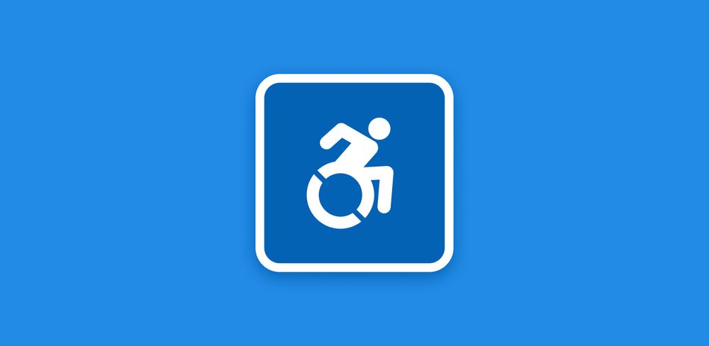
With the help of designer Tim Ferguson-Sauder, they brought their vision to fruition and created the new icon that is often seen replacing the old design and is becoming more common in public spaces worldwide. Thus, what was once considered a street art guerilla campaign, became more formalized into advocacy in the form of the Accessible Icon Project.

The updated accessibility icon is now used worldwide.
But if an icon serves to lessen the cognitive load, so users are empowered to maneuver an environment easily, isn’t a change to what’s normative likely to confuse? The issues surrounding how and when to make design changes to common public symbols are complex and should be undertaken with care to avoid confusion.
And yet, to convey a meaning that more accurately reflects a population’s lived reality requires deep, thoughtful consideration. Glenney explains.
You do want an icon to be successful, just like the word, where letters represent our ideas. So we want an icon to function in that manner. And for people who use our symbol, like in Washington state or New York, it pretty much functions in that way. But the initial disruption [of the redesigned icon] bumps up the educational component of what it is to be a person with a disability, right? It highlights that a person with disabilities is active. They’re agents unto themselves.

Font Awesome has used a variant of the Accessible Icon Project’s icon.
Unfortunately, governing boards responsible for formalizing public symbols used on signage often resist the Accessible Icon Project’s aims. But that hasn’t stopped the project’s forward momentum.
Glenney likens the progress of the Accessible Icon Project to pedestrians finding shortcuts through designed public spaces — a phenomenon that architects, design theorists, artists, and philosophers call “desire paths.” Thus, says Glenney, “essentially we made a desire path for an accessible symbol.”
But in instances when the public finds a new, better way through their environment and requests change, often governing boards responsible for city planning resist and claim they’re unable to make accommodations because it doesn’t fit formal city plans.
“It’s illegal to use, according to the Federal Highway and Transportation Agency. They did have a memorandum in 2016 that essentially says nobody can use this symbol in America. But New Mexico, Ohio, Rhode Island, New Hampshire, [and others], were all going to use it. And then, the Federal Highway and Transportation Agency put a cease and desist against the use of the icon. And so these states still use the symbol, but they don’t do it officially. So it’s kind of awesome.”
As the traditional accessibility icon has become outdated, like-minded advocates across the globe embrace the updated icon. They’re finding their own “desire path” forward in a way that better reflects disabled populations and fosters inclusion.
By 2014, the State of New York adopted and updated their accessibility symbol; the MoMA accepted the icon into their permanent collection. The Boston Globe, and many other news networks, picked up the Accessible Icon Project story. Many states have since adopted the symbol’s use. Also, Apple, Twitter, What’s App, Taxi of Tomorrow, and 99% Percent Invisible use the new emoji.
Glenney is glad for the change and hopes to see ongoing advocacy and creative variations of the icon.
“I’d love to see a designer make a two-tone icon that becomes acceptable use that distinguishes the wheel from the person. Or to just find a symbol for disability that just gets rid of the wheel altogether, given that only twelve percent of people with physical disabilities have a wheelchair, right? I think more disruptions will happen in the future, but this is the first one that may have had to happen. It’s Progress.”
Additional Resources
- Get more info about the Accessible Icon Project.
- Learn how to make Font Awesome icons more accessible for the web.
- Check out Font Awesome’s various accessibility icons.