Silk Suit, Black Tie, I Don’t Need a Reason Why
When you need subtle design touches for your project, the right icons can make a big difference. That’s why we’re so excited to announce Font Awesome Sharp.
In this first round of icon sharpening, Sharp Solid is strutting its stuff down the catwalk, with Sharp Regular, Light, Thin and Duotone styles to follow in the months to come.
Take a look at the new style!
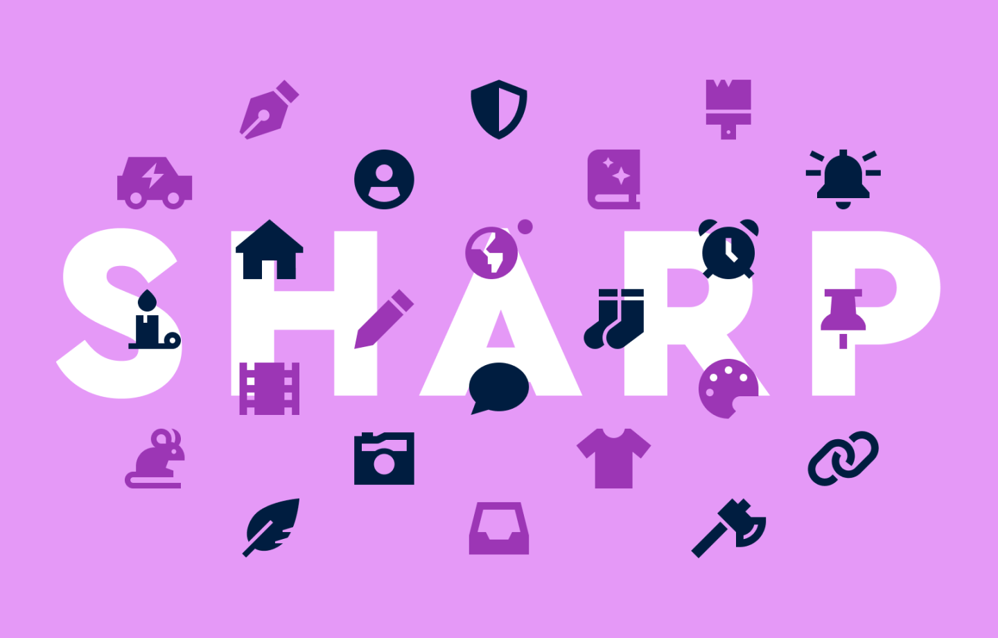
We’re taking our first step into a sharper world.
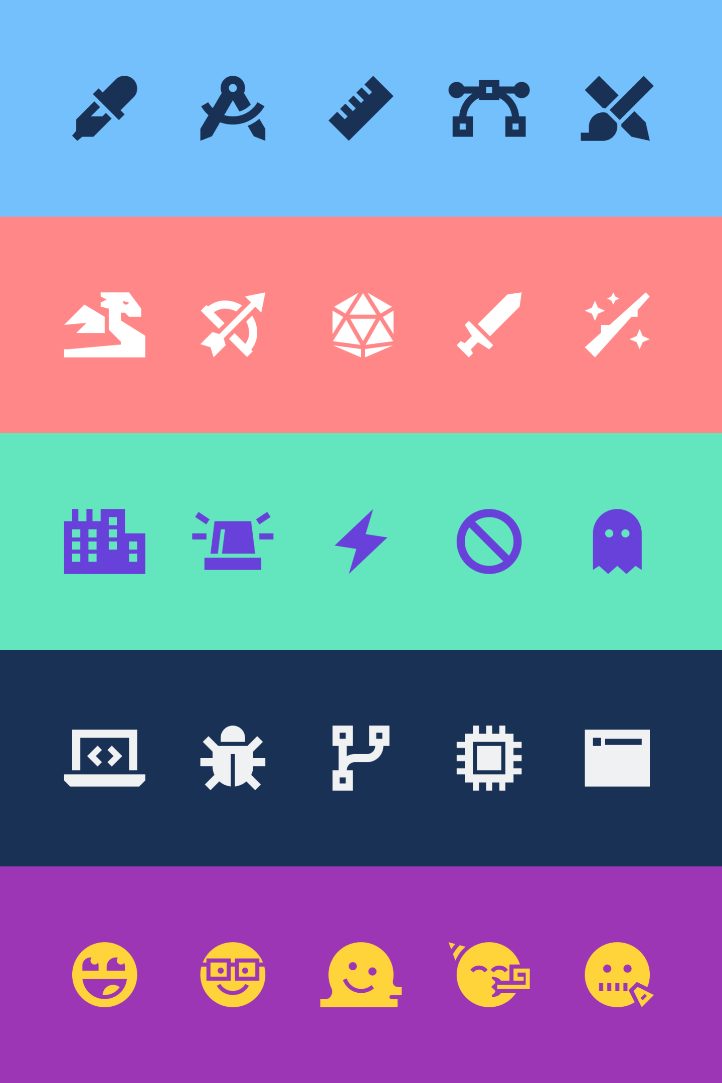
All your favorite categories are still here!
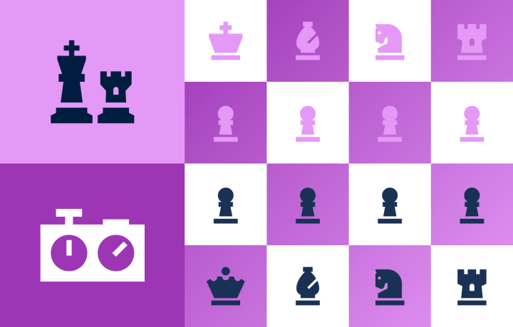
Keep your strategy close to the chess.
Sharp Typefaces Deserve Sharp Icons
Similar to the Thin style, we envisioned Font Awesome Sharp with a clean, modern look that pairs nicely alongside sharp typefaces like Helvetica, Roboto, Aperçu, and Franklin Gothic, among others.
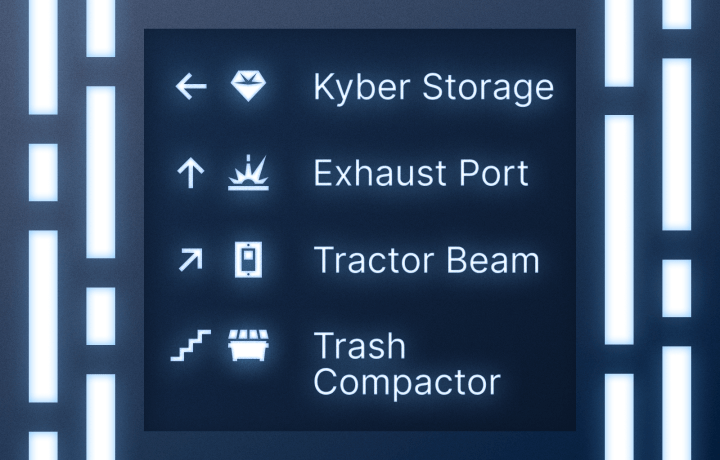
Aren’t you a little Sharp for a Stormtrooper?
Sharp icons are also a smart choice for Fintech projects when you need to convey a professional, grounded look and feel.
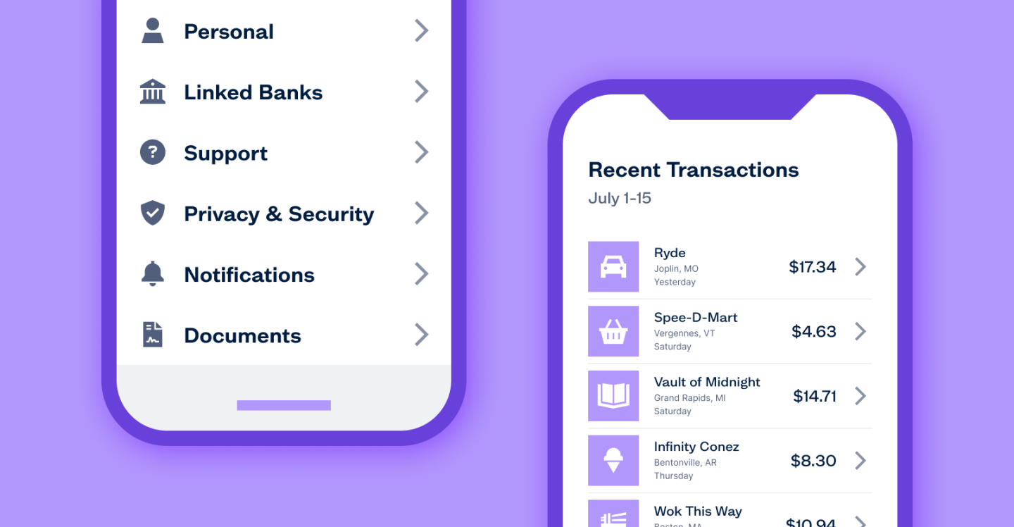
They charge extra for sprinkles.
Font Awesome Classic vs. Font Awesome Sharp
Like all our icons, Sharp is built on a 16 pixel grid but we intentionally cut out as much rounding as we reasonably can. This doesn’t do the trick in every case (*cough* circles *cough*), but if we could strip out a curve and still have the icon make sense, we did it.
Oooh, ahh! The classic style transforming to Sharp right before your eyes!
Now that’s a tasty transformation.
With the addition of the Sharp Solid icons, you’ll get an additional 3,000+ icons for your design toolbox, so you’ll be sure to have what you need to dress up your project with a look and feel that’ll turn heads.
Sharp is only available with a Pro subscription, though. And to celebrate the new edition of the Sharp icon family, we’re taking $20 off your first year’s subscription. That’s only $79 dollars — but the offer is available for a limited time, so take advantage of the deal now!
Along with Sharp, your Pro subscription includes access to Font Awesome Classic with multiple icon styles to choose from including:
- Solid — Make a bold statement, even in small sizes.
- Regular — Smooth out your design with easygoing, readable icons.
- Light — Turn down the tone just a smidgen for when you need a lighter touch.
- Thin — Style your site with the latest super-light designs.
- Duotone — Go big with an illustrated feel by adding a pop of color.
You also get more Kits, pageviews, custom icon upload, Actual Human™ Support, and more!

